Hearthy is a wellness company created with the health and well being of individuals in mind. The founder, Riaz Surti, was inspired to create this brand because of the difficulties his mother was facing with her heart health.
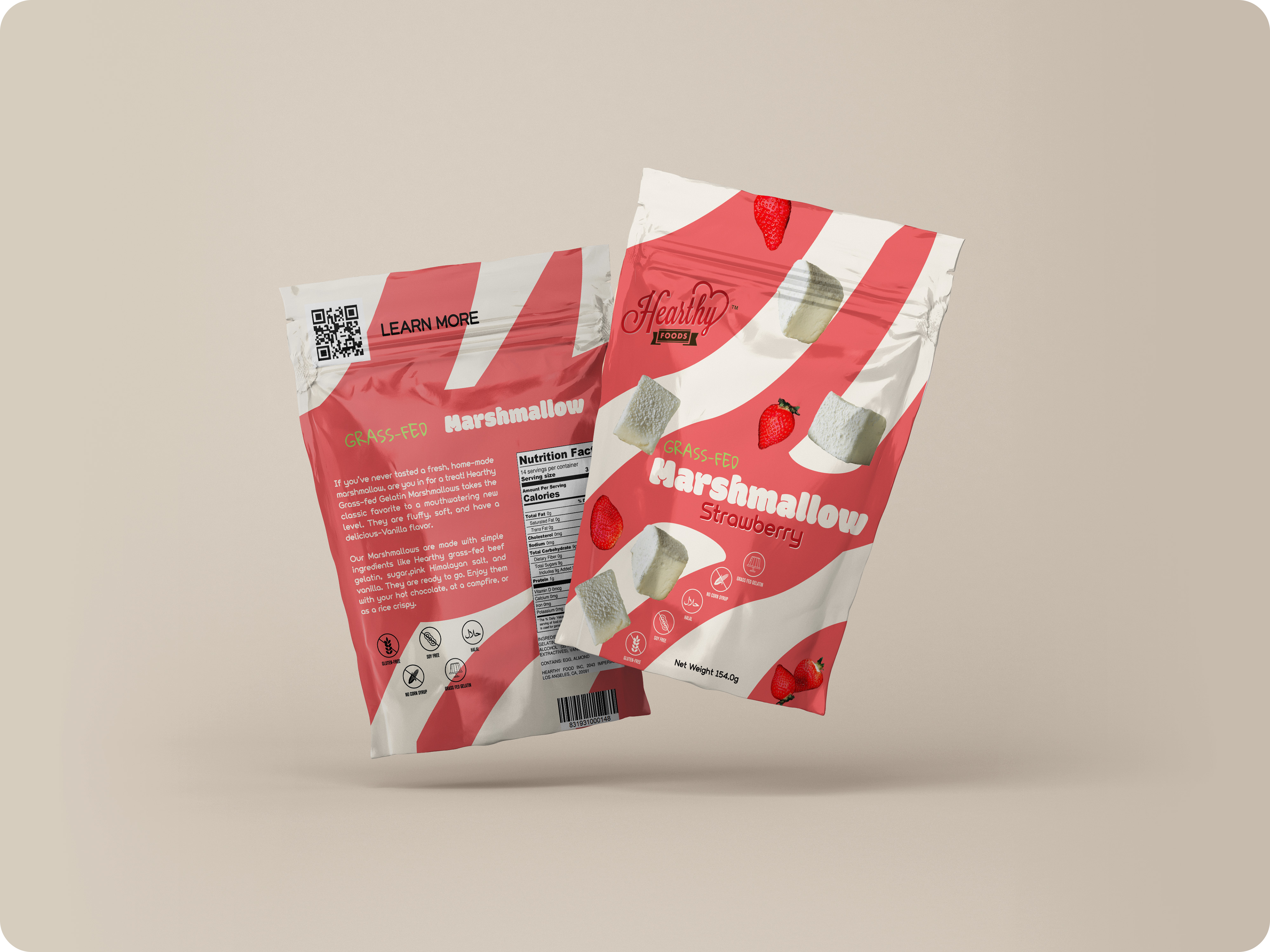
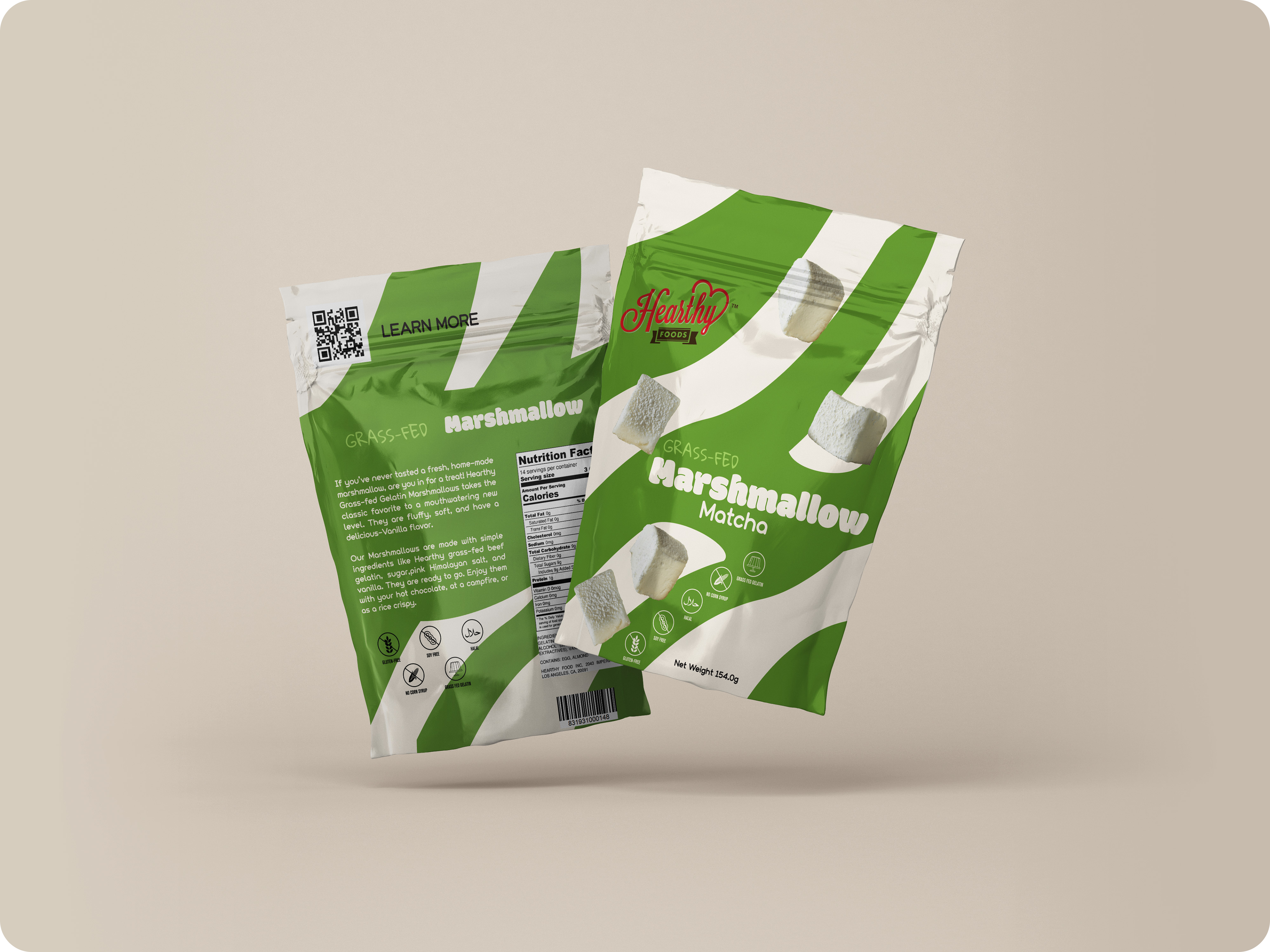
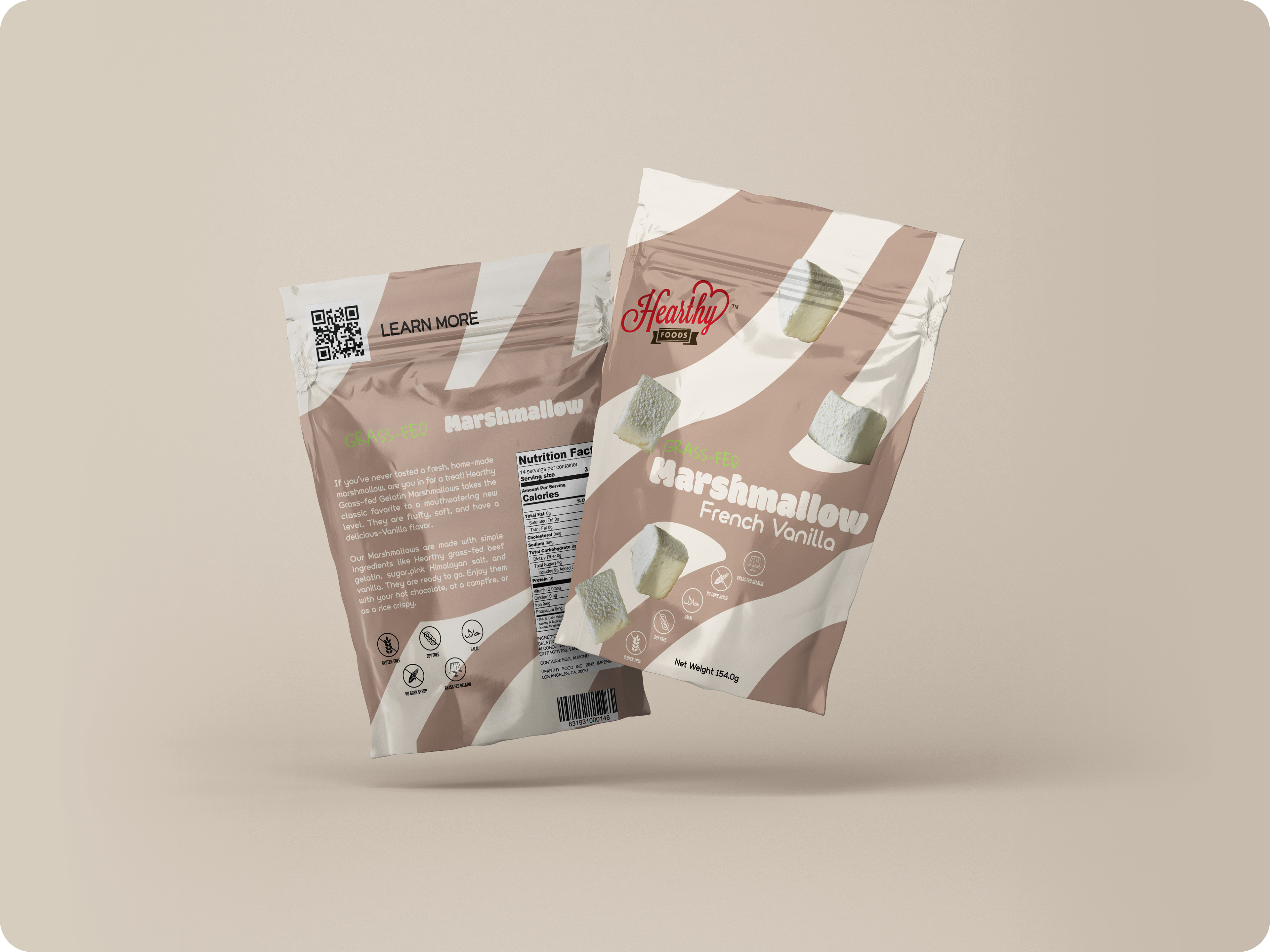
Beginning with the brief details, Hearthy's problem with their current packaging was that it was too simple and lacked appeal. The goal of this packaging redesign was to evoke fun, vibrant colors inspired by candy and marshmallows, with the main flavor being French vanilla. With that in mind, creating a design system that could extend to the other package flavors was also a priority.
My role:
Visual Package Redesign
Competitive Audit
Visual Ideation
Regulatory Compliance

For the design thinking process I always turn to the psychology of shapes and how they change our perception of what we see. This is why I chose circles as the primary shape in the design. Circles convey softness and warmth, which is exactly what I wanted to communicate about the marshmallows displayed on the packaging. I also introduced a wavy effect to make the design feel more playful, friendly, and approachable after all, this is a packaged product, and you want consumers to pick it up.